Generating Weird & Beautiful Architecture Diagrams with Claude
As an architect, I love doing diagrams. I think visually. In the past I loved using Miro, mermaid, and a bunch of others, but only recently (past week!) did I try and experiment with drawIO and its XM files format. This whole post is just about a fun late night experiment I did that I wanted to share.
GenAI is removing a lot of the friction to experiment and I love it.
Anyway, a common use case for me is that I want to describe and draw an architecture diagram for a proposed architecture. I'm not talking about the live version of doing it with people in the room, but when preparing for a meeting and coming up with a few different variations of diagrams. I love to tinker and I can spend hours on diagrams. I like them to look visually interesting and useful.
At my new job we use a lot of diagramming tools including DrawIO (local app), Which I've not used before. Last night I played around with it, and discovered it has a useful xml file format.
What if I could generate that XML with claud? could I provide an architecture description and generate a nice diagram or will it look like crap?
I was delighted to see claude opus 4.5 generated remarkably detailed, readable and professional looking diagrams for my purposes from prompts which I refined using claude as well.
the process was:
- describe architecture in my own words as a prompt, and ask it to:
- generate a prompt that describes this architecture so that we can then feed this to an agent that will create a drawio xml file diagram from it.
- Run the generated prompt in claude opus 4.5 and see what happens.
The first time I tried this I asked it to create a diagram tha describes the main architecture of a kubernetes cluster and its components. (very much like the sentence I just wrote here). To my surprise here's what I got:
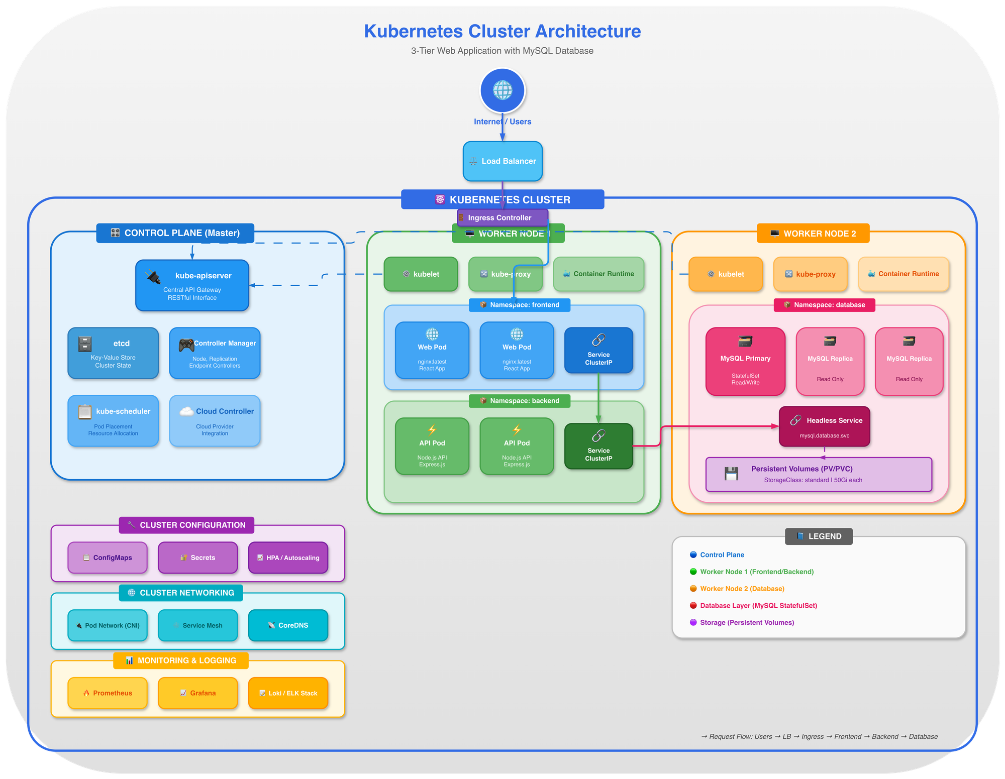
OK. This is... useful! And it only took a couple of minutes. The nice thing is, the better the instructions the better the diagram.
Here's another diagram I generated with a more detailed prompt asking it to keep official AWS icons and diagram guidelines with a detailed diagram of some AWS services relating to moving to ECS or lambda functions:
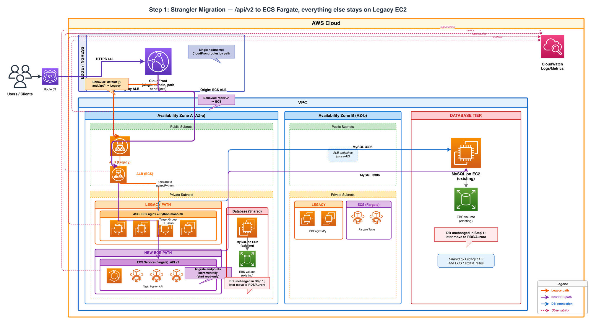
I did not touch this diagram. This all came out of Claude opus in one shot from a prompt (that was very detailed, but was also generated form an architecture description)
More Styles Please!
Then i started asking myself as I was playing with the styling instructions - what other "styles" would it know to create if I asked it?
So I asked Claude to give me 10-20 other styles (as crazy as possible) in which to generate the same 3-tier web application architecture with. ANd it came up with what you see below. SOme of them are not useful byut very creative, and some of them are just weird. But I lvoe that I can be creative with this style and this might be useful to others who read this. Think of it more like an art project.
Each diagram below shows the exact same 3-tier web architecture - presentation, application, and data tiers - rendered in a completely different visual style. All generated by Claude as raw draw.io XML. No manual drawing required.
We start with professional, production-ready styles and gradually descend into artistic madness.
Professional & Clean
AWS re:Invent (Featured Example)
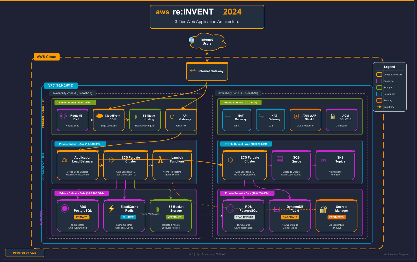
This is what a "standard" architecture diagram looks like when generated by Claude asking it to use the AWS re:Invent style with official AWS iconography and conference presentation aesthetics.
What Claude generated:
- Color scheme: AWS orange (#FF9900) as primary accent on dark background (#161E2D)
- Service boxes: Each AWS service has its icon-style box with colored accent bar
- Proper naming: Amazon Route 53, Amazon CloudFront, AWS WAF, API Gateway, Application Load Balancer
- Infrastructure details: VPC boundaries with CIDR notation, Availability Zones (us-east-1a, us-east-1b), private subnets
- Multi-AZ setup: Primary and standby databases with sync indicators
- Service categories: Color-coded legend (Compute, Database, Storage, Security, Networking)
The prompt was simply: "Create a 3-tier architecture diagram in AWS re:Invent conference style"
Claude understood that this meant dark backgrounds, orange accents, proper AWS service naming conventions, and the visual language of cloud architecture diagrams.
Corporate
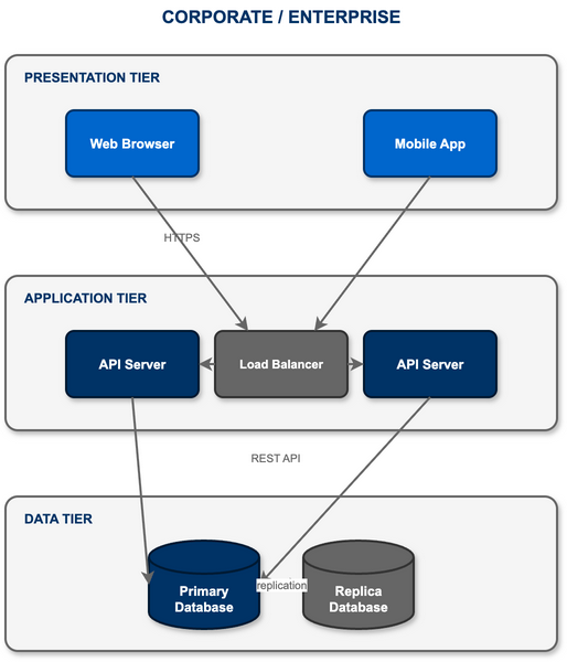
The safe choice: blue gradients, professional fonts, and the kind of diagrams that make it past any design review. Perfect for enterprise presentations.
Material Design
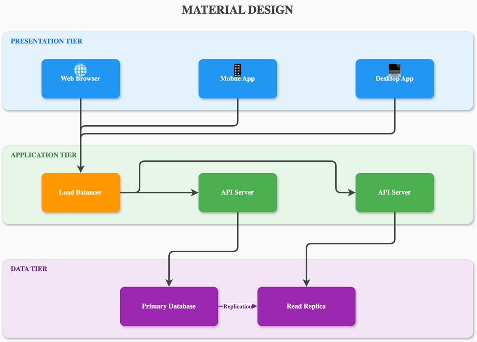
Google's design language with paper-like layers, subtle shadows, and the signature FAB button. Clean, purposeful, and touchable.
Minimalist Flat
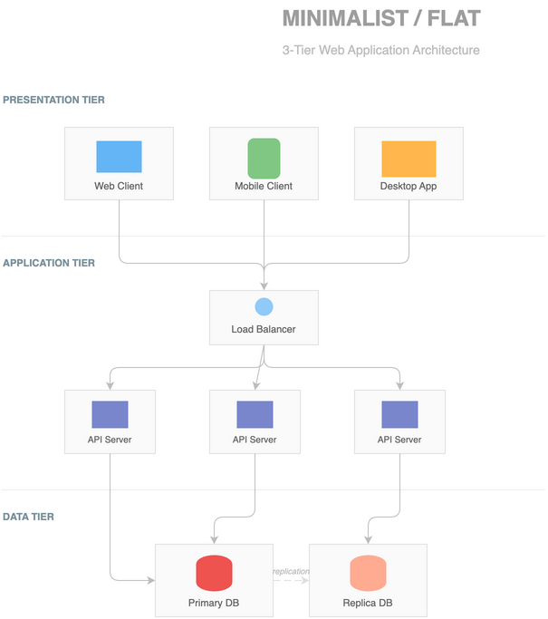
Ultra-clean lines, no gradients, no shadows. Pure geometric shapes in a carefully curated color palette. Less is more.
Swiss Style
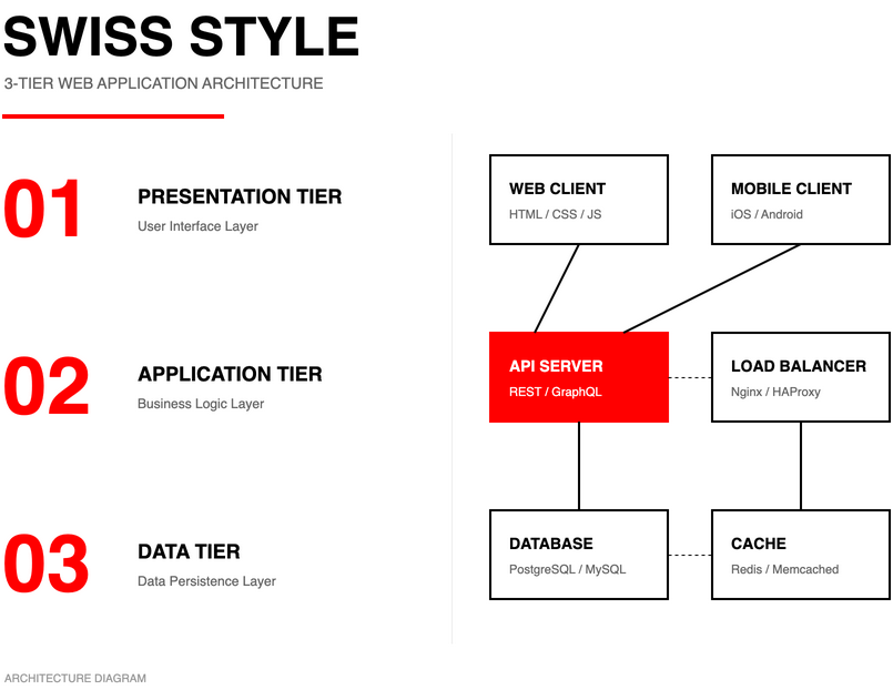
International Typographic Style with Helvetica, mathematical grids, and ruthless minimalism. Form follows function.
Blueprint
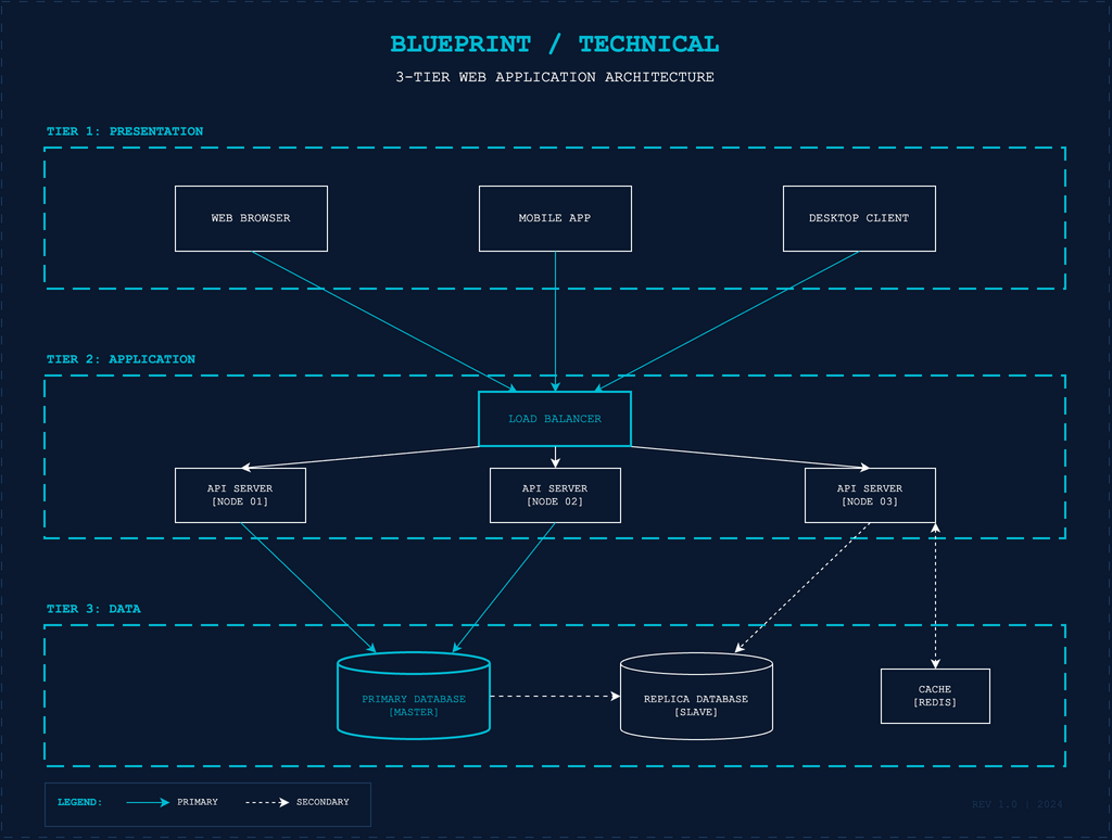
Technical drawing style on blue background with white lines, dimension markers, and engineering precision. Feels like real architecture.
Tech Nostalgia
Windows 95/98
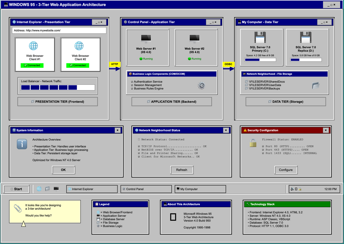
Classic gray UI with beveled 3D buttons, blue title bars, and that unmistakable teal desktop. Complete with "My Computer" icons and a helpful Clippy.
macOS Aqua
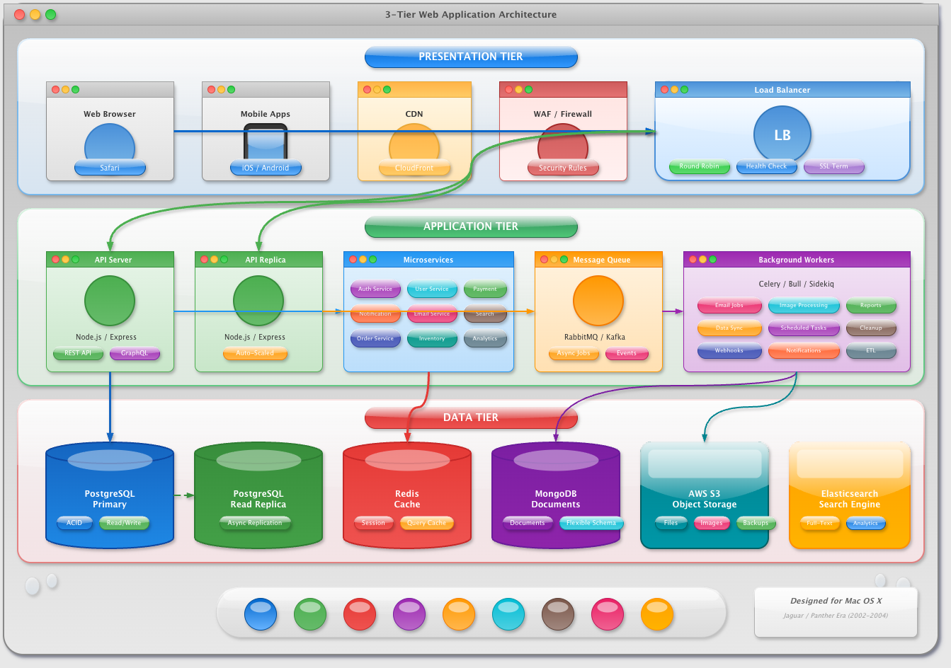
Early 2000s Apple glossiness with gel-like buttons, pinstripe textures, and those iconic traffic light window controls. So shiny you want to lick it.
Dark Neon
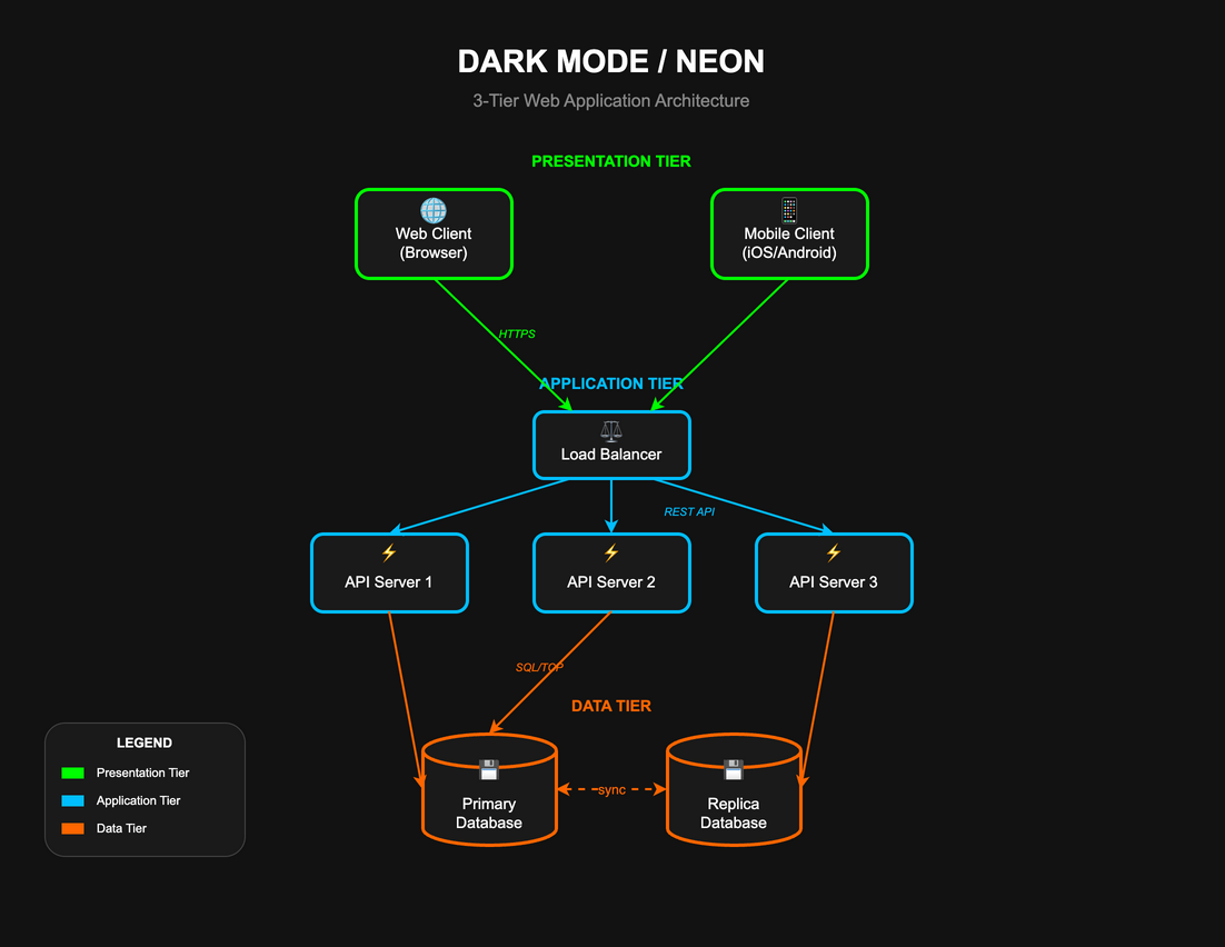
Glowing components on pure black backgrounds. Each element pulses with electric color against the void. Modern and sleek.
TRON
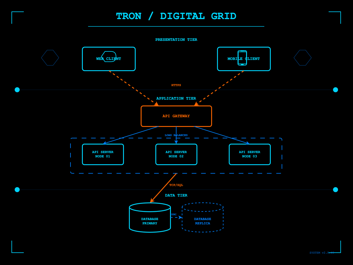
(FYI red lines are actually moving in the drawio file redndering) Digital frontier with glowing cyan circuits on pure black. Light cycle trails and grid patterns straight from the MCP's domain.
Elegant Artistic
Art Deco
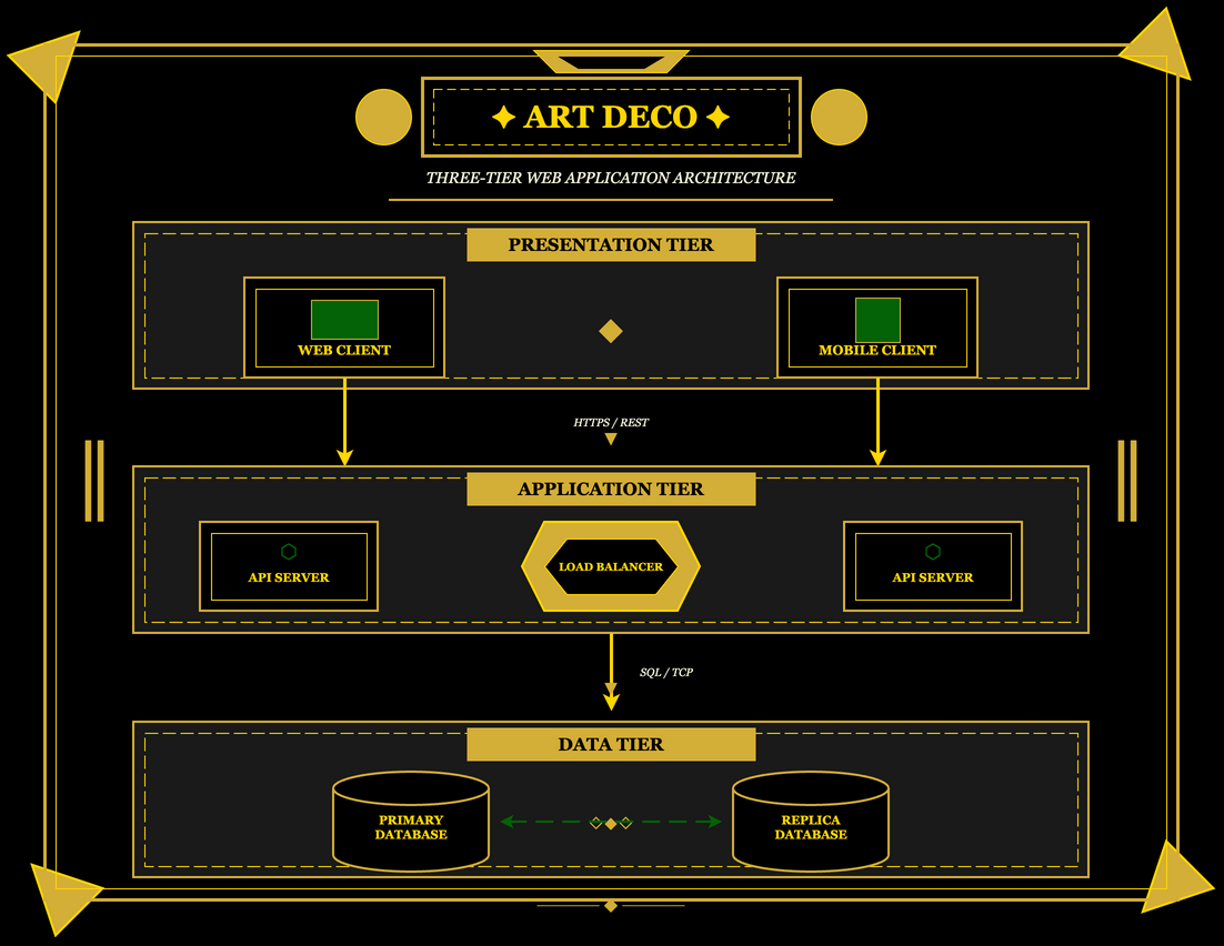
1920s glamour with geometric sunbursts, gold and black color schemes, and the elegant symmetry of the Chrysler Building era.
Art Nouveau
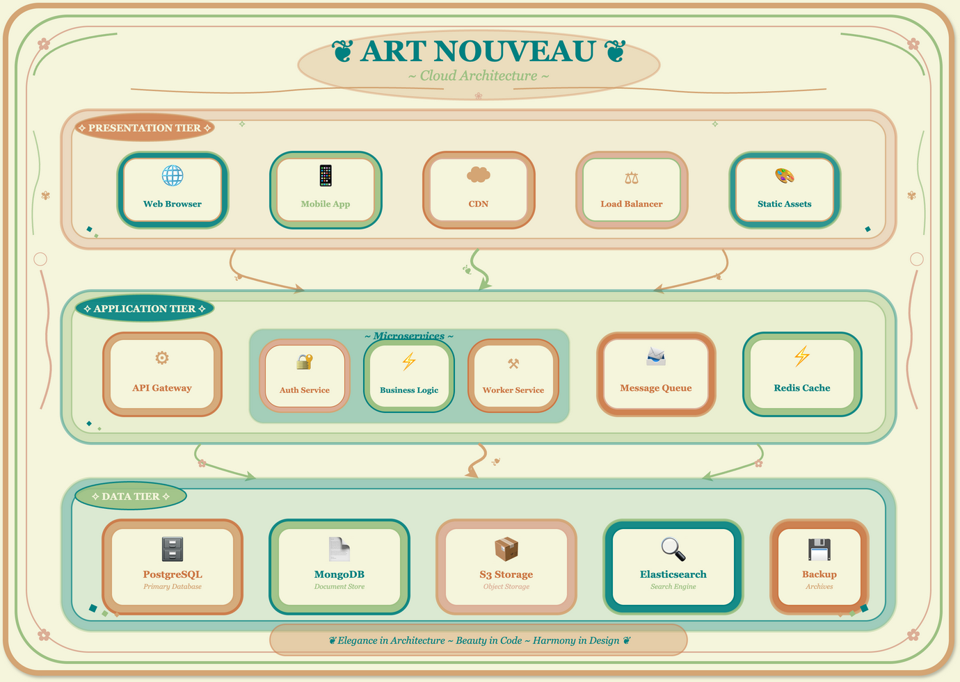
Alphonse Mucha-inspired flowing organic lines, peacock feathers, and nature motifs. Elegant curves and botanical decorations wrap around each component.
Stained Glass
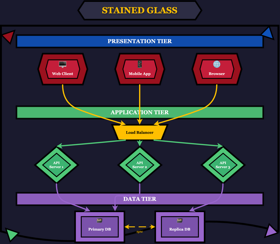
Cathedral window aesthetic with bold black leading lines separating jewel-toned glass segments. Sacred and luminous.
Noir
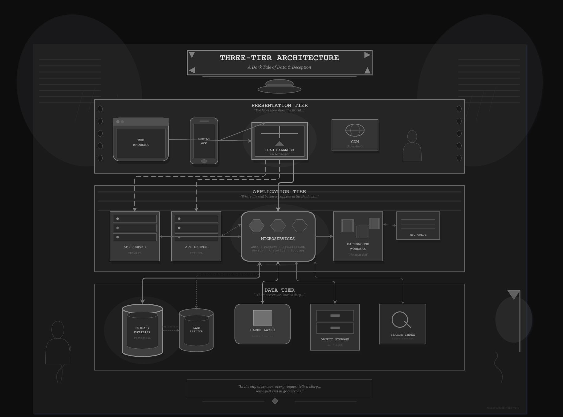
Black and white film aesthetic with dramatic shadows, venetian blind patterns, and femme fatale mystery. Moody and cinematic.
Cultural Heritage
Japanese Ukiyo-e
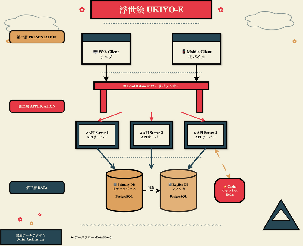
Traditional woodblock print style with wave patterns, cherry blossoms, and Mount Fuji. Hokusai meets cloud architecture.
Samurai
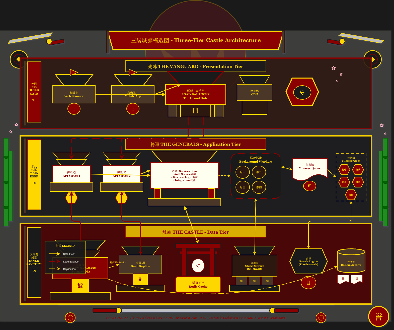
Feudal Japanese aesthetic with katana motifs, clan mon emblems, and armor-inspired components. Honor and precision in every connection.
African Kente
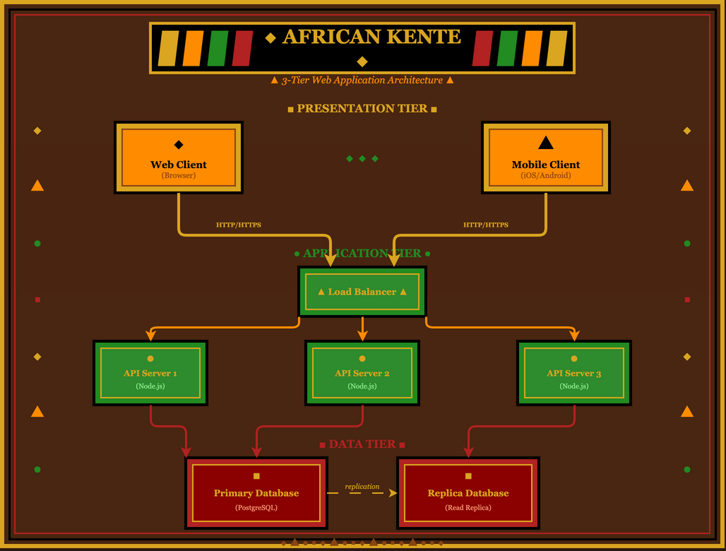
Vibrant geometric patterns inspired by Ghanaian royal cloth. Gold, green, red, and black in intricate woven designs.
Aztec/Mayan
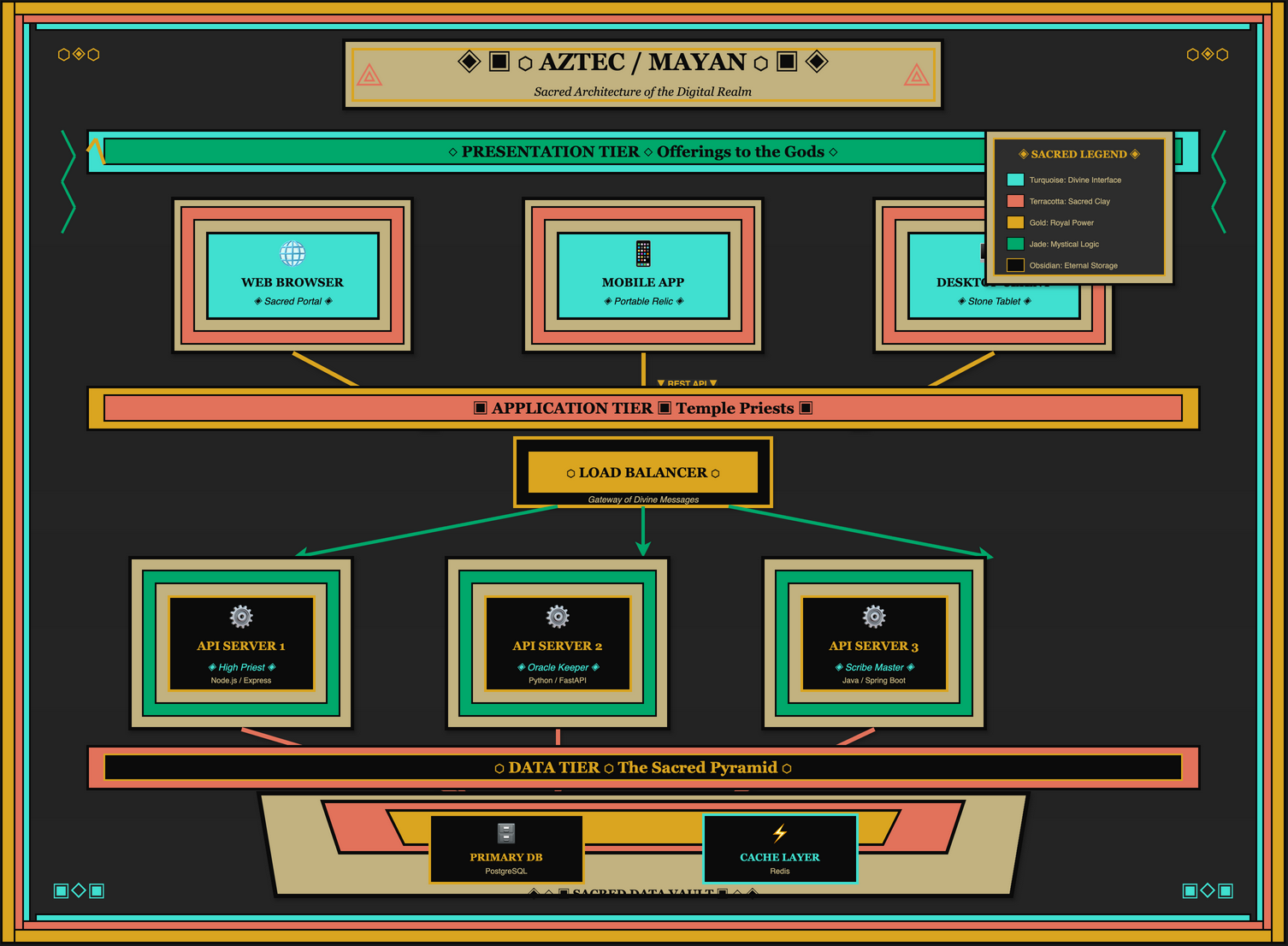
Ancient Mesoamerican temple aesthetics with stepped pyramids, serpent motifs, and hieroglyphic-style decorations.
Soviet Constructivism
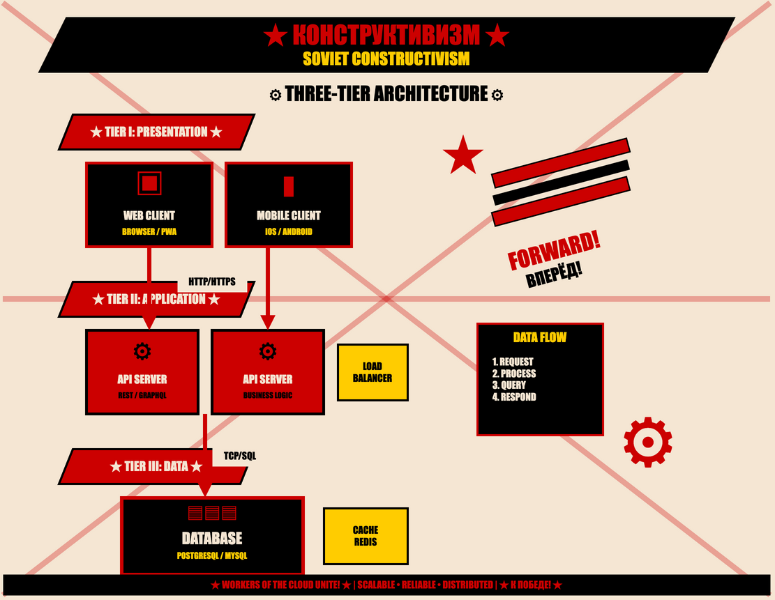
Bold red and black propaganda poster style with diagonal compositions, worker imagery, and revolutionary typography. Comrade Architecture!
Thematic & Playful
Chalkboard
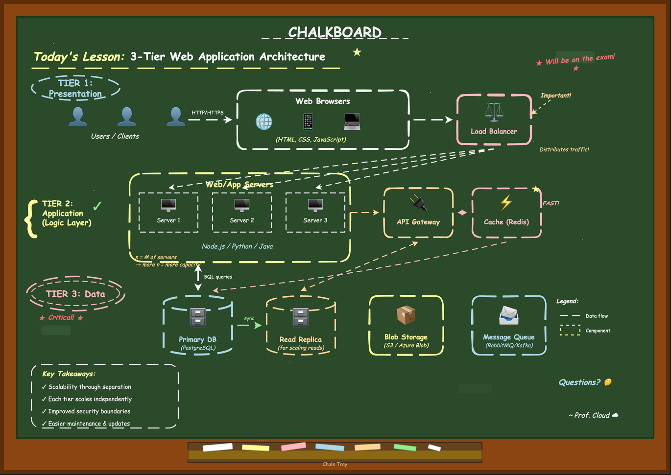
Green or black board with hand-drawn chalk elements, eraser smudges, and "Today's Lesson" headers. Back to school vibes.
Newspaper
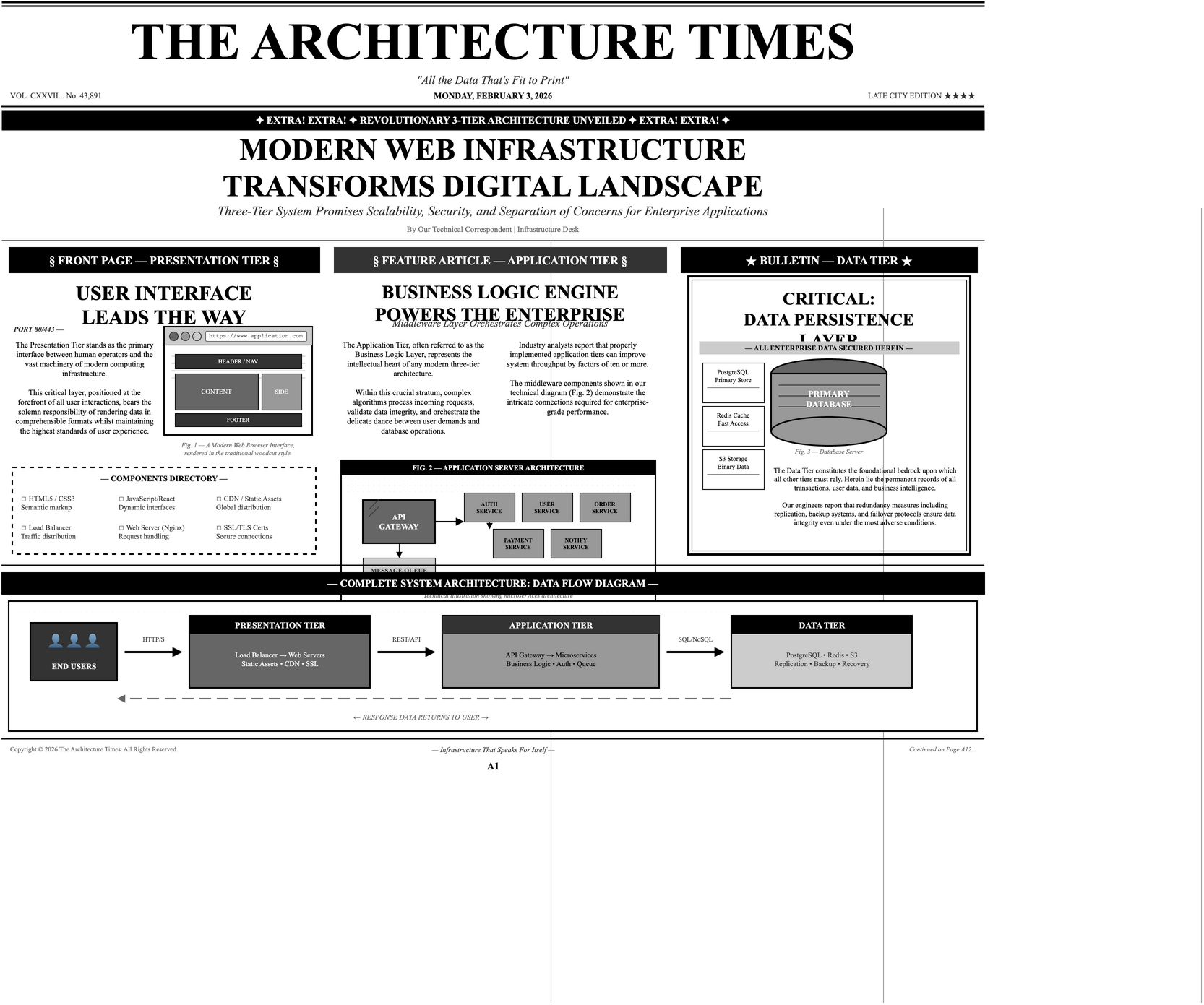
"The Architecture Times" - halftone dots, woodcut illustrations, classified ad typography, and headline drama. Extra! Extra!
Comic Book
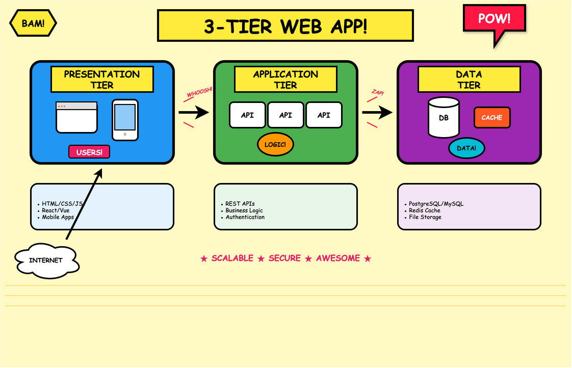
POW! BAM! Bold outlines, Ben-Day dots, speech bubbles, and dynamic action lines bring superhero energy to your diagrams.
Brutalist
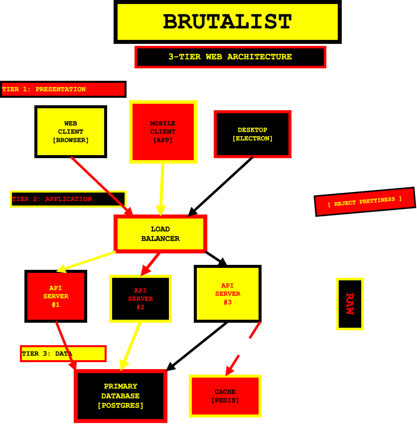
Raw concrete aesthetic with heavy black borders, monospace typography, and intentionally stark, uncomfortable design. Aggressively functional.
Gaming & Pop Culture
Minecraft
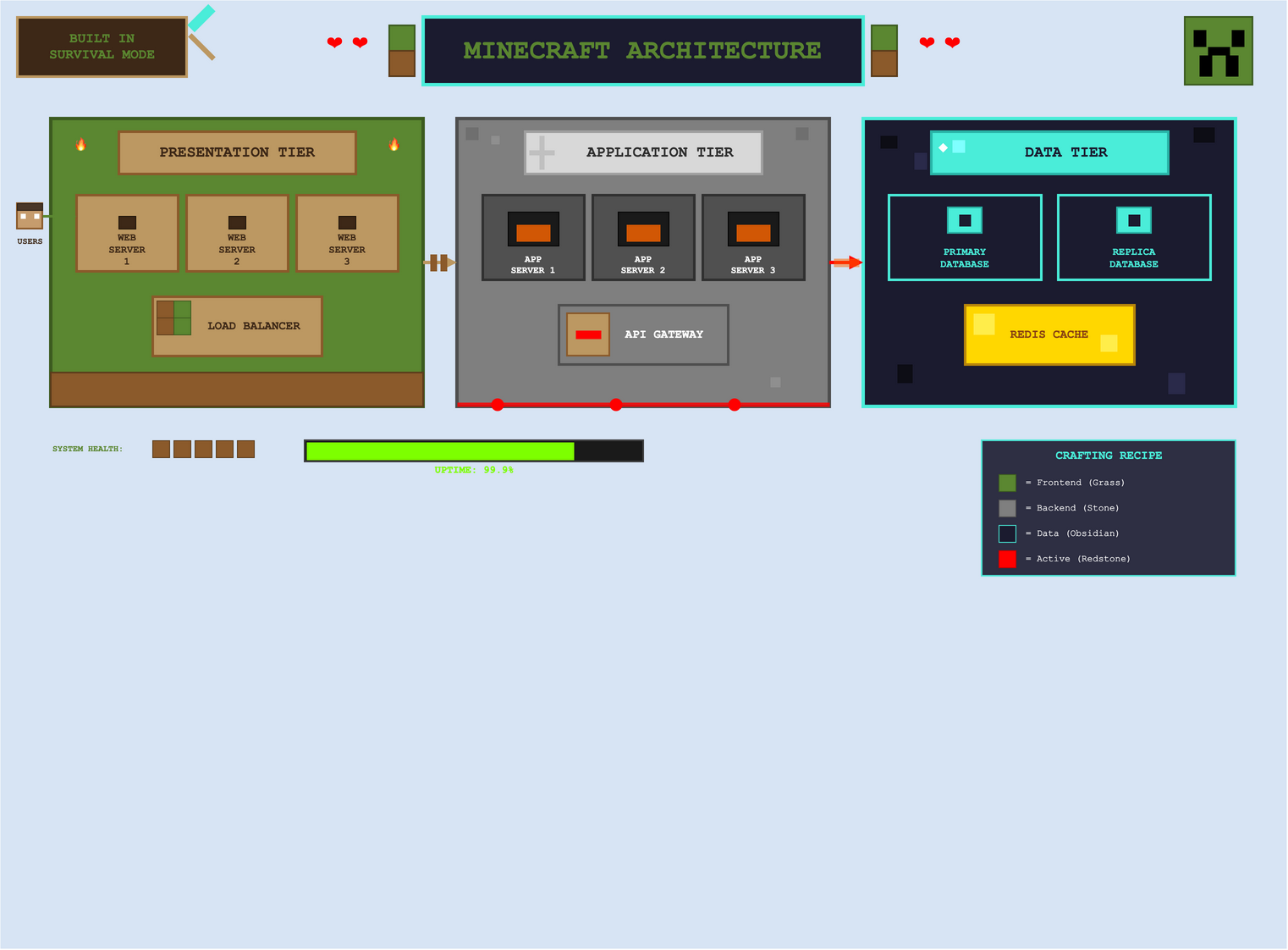
Blocky pixel aesthetic with grass, stone, and obsidian textures. Creeper faces, redstone circuits, and health hearts bring gaming charm.
LEGO
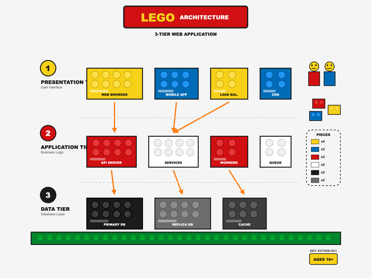
Brick-built components with visible studs, instruction manual numbering, and that unmistakable click-together aesthetic. Ages 16+.
Fallout Pip-Boy
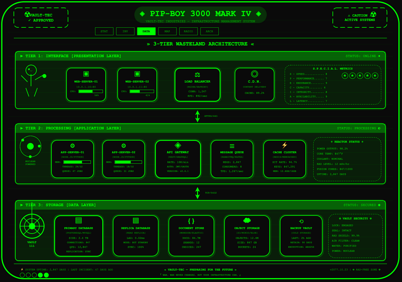
Green CRT phosphor glow with scan lines and retro-futuristic nuclear aesthetics. Vault-Boy mascot and S.P.E.C.I.A.L. stats for the wasteland.
Origami
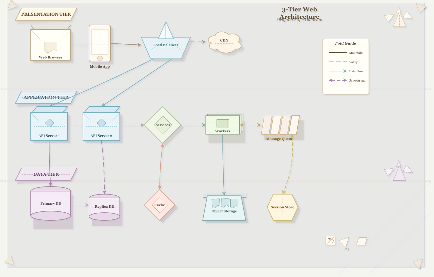
Folded paper aesthetic with visible creases, mountain/valley fold lines, and paper crane decorations. Delicate and geometric.
Anime & Cute
Studio Ghibli
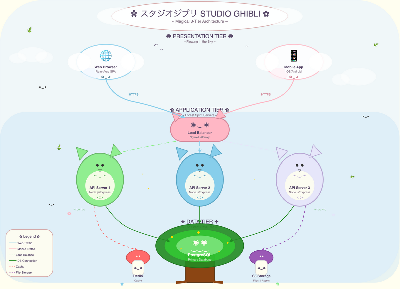
Miyazaki-inspired watercolor warmth with Totoro-like creatures, floating castles, and that magical sense of wonder. Pure whimsy.
Kawaii
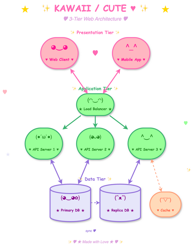
Japanese cute culture with blushing cheeks, sparkles, pastel colors, and components that look like they want to be your friend. UwU.
Classical Art
Impressionist
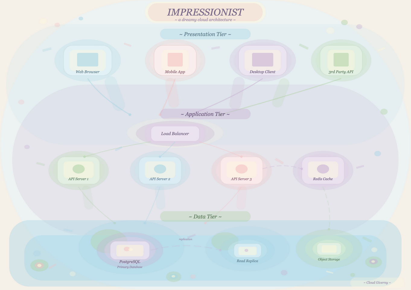
Soft, blurry edges with pastel color dabs inspired by Monet's water lilies. Dreamy atmosphere with dappled light effects. Technical diagrams as fine art.
Baroque
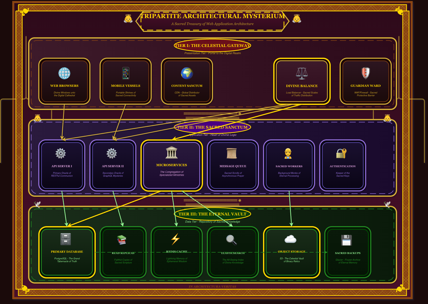
Ornate cathedral grandeur with gold filigree, cherubs, and theatrical velvet curtains. Components become sacred reliquaries dripping with religious opulence.
Retro Aesthetic Madness
Vaporwave
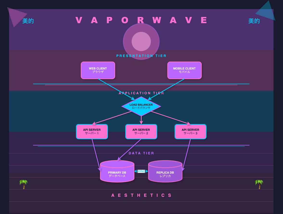
A E S T H E T I C pink and cyan gradients, Greek statues, palm trees, and endless sunset grids. Welcome to the mallsoft architecture.
Cyberpunk Synthwave
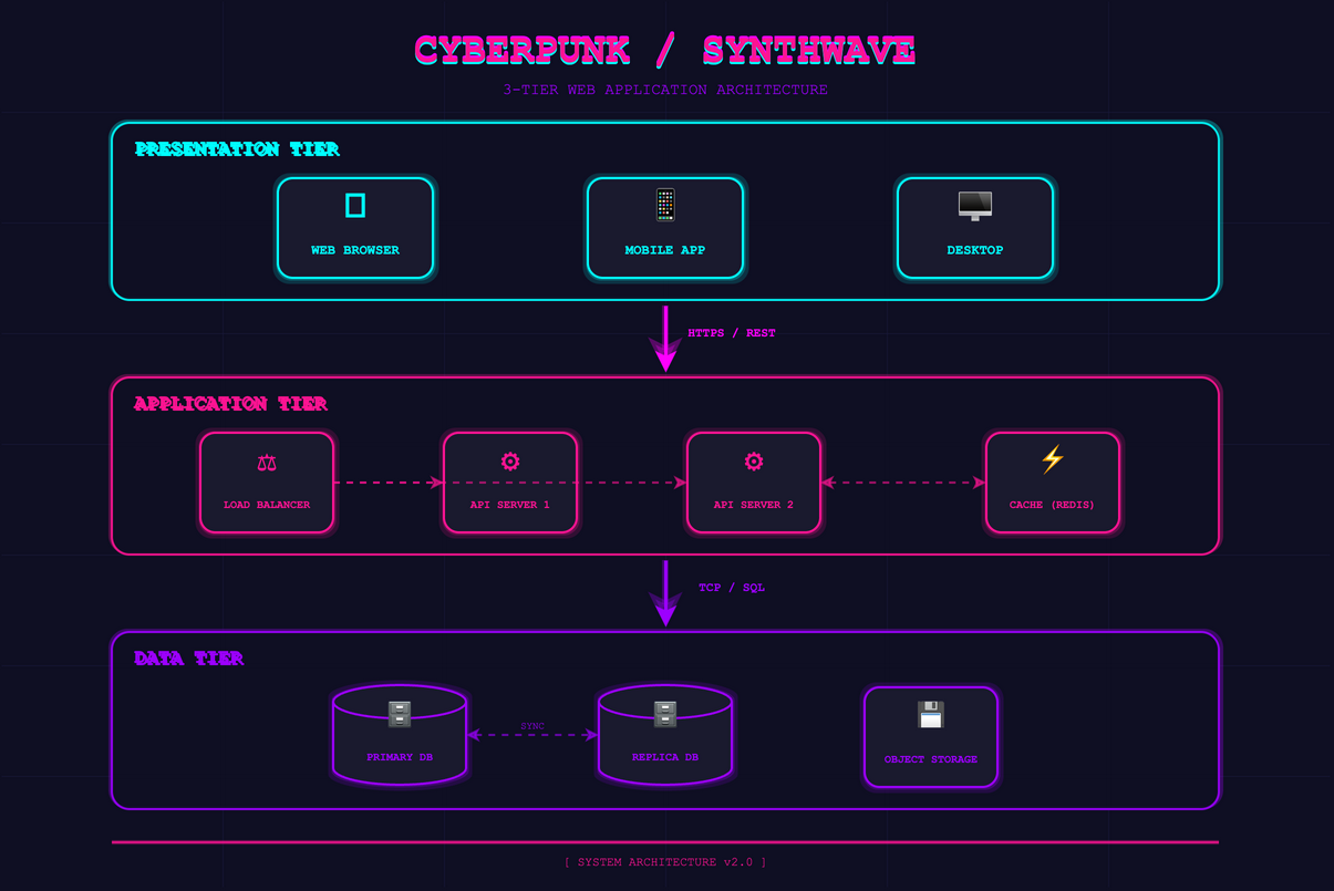
Neon-drenched cityscapes with hot pink and electric blue. Chrome text and laser grids against a midnight sky. The future is now.
Memphis Design
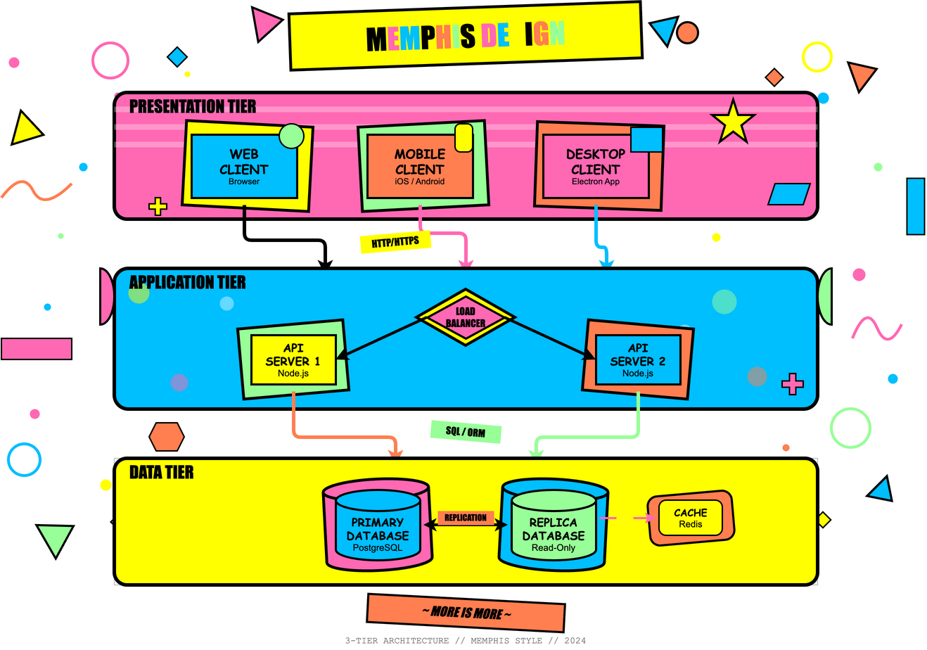
1980s postmodern explosion with squiggles, confetti, clashing patterns, and deliberate "bad taste" that's actually brilliant. Maximum chaos.
Abstract & Surreal
Cubist
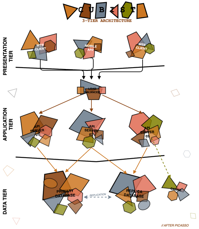
Picasso-style fragmented geometric shapes showing multiple perspectives simultaneously. Earthy tones with angular, overlapping forms. Is it a database or a guitar?
Surrealist

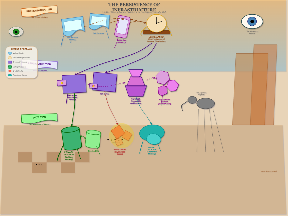
Dali-inspired melting shapes and dreamlike imagery. Floating eyes, elephants on stilts, and checkerboard desert landscapes. Architecture from a fever dream. The most unhinged style in the collection.
Summary
All diagrams generated by Claude Code Opus 4.5 as raw draw.io XML. No manual drawing done. All styles were suggested by Claude Opus 4.5 in about 3 prompts asking it for crazy creative styles.
This was a fun exercise!.

